Women's health
The product photos were ads with text baked in. So that's where we started.
Store designed and built. The theme is ready and waiting for the client to take it live.
Scope
What the work covered
The starting point
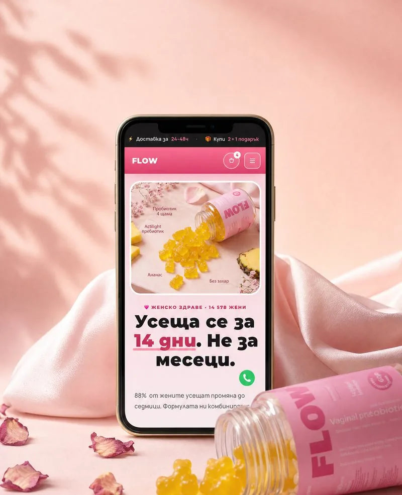
The store sells women's health supplements under the Flow brand — a probiotic, a multivitamin, gummies and bundles. It ran on a purchased theme and needed to read like a modern international brand.
The brief was put exactly like this: make it look like a store with eight-figure revenue. The first two design directions were rejected — the clinical minimalism read like a report, not like a brand that wants you to buy from it.
What was broken
The problem wasn't the code. All of the product photography was ad creatives with text baked in and a different background on each — red, blue, green, dark. There were simply no clean packshots. No amount of theme work fixes that.
Second, the reviews on the page showed made-up counts, while the real reviews sat in Judge.me. Third, the Shopify-hosted Montserrat and Manrope fonts ship with Latin characters only, so Cyrillic still fell back to a system font.
The approach
How we did it
We started with the photos, because without them nothing else matters. The packaging was cut out from the background automatically, the baked-in text was cropped out, and every photo was placed on a shared pink tile with a soft shadow. Only then did the build begin.
- The product page includes bundle selection, a sticky order button, a comparison, the mechanism of action and clinical sources with real publication identifiers
- A seven-question quiz that recommends a formula
- A build-your-own box of four products with a tiered discount and a counter of filled slots
- A three-tier loyalty program
- A reviews section that reads directly from the Judge.me metafields and draws the stars itself, because the app's styles don't load
- The Cyrillic fonts are embedded in the theme as data, so they don't depend on Shopify
One four-star review was left in on purpose. A page with nothing but five-star reviews doesn't read as real.
Result
What changed
Next step
Be our next project.
Tell us what you sell and what's holding you back. We'll send you a written plan.